


There are few sinking feelings quite like opening a fresh pallet from an offset print run of 20,000 product boxes, pulling out a sample, pointing your smartphone camera at the code, and seeing… nothing.
The camera hunts for focus. The yellow framing bracket flickers for a split second, then disappears. You try an iPhone, an older Android, different angles, daylight, office lighting… and the result is the same: the code refuses to scan reliably.
In digital design, a broken link is a two-minute fix in a CMS or a server config file. In print production, a broken link is a commercial catastrophe: pulped stock, lost client trust, delayed product launches, and thousands of euros in reprints.
Most print failures do not happen because the URL was incorrect. They happen because the graphic asset was treated like a decorative illustration rather than an optical machine-readable barcode.
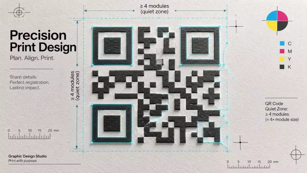
Here is a practical prepress guide to ensuring your QR codes scan instantly on any substrate, every single time.
1. Vector vs. Raster: Why a 300 DPI PNG Is Still a Liability
The most common trap in graphic workflows begins with a quick Google search for a “free QR generator.” A designer downloads a 1000×1000px PNG, places it into Adobe InDesign or Illustrator, scales it down to fit a label, and assumes that because the file is high-resolution, the output will be sharp.
Under a prepress loupe or during plate exposure on a computer-to-plate (CTP) system, rasterized barcodes reveal their weakness: anti-aliasing.
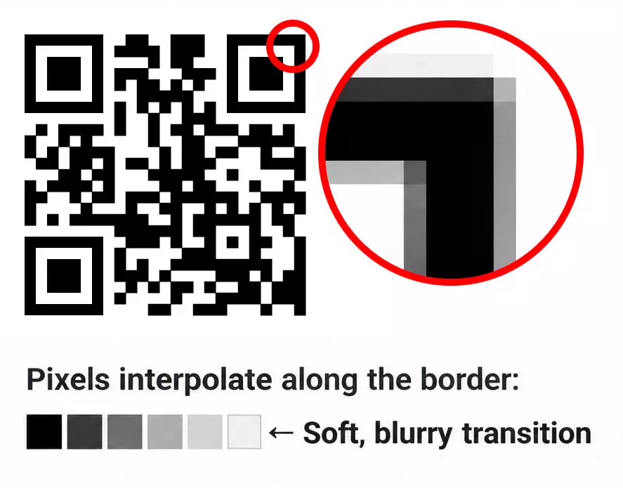
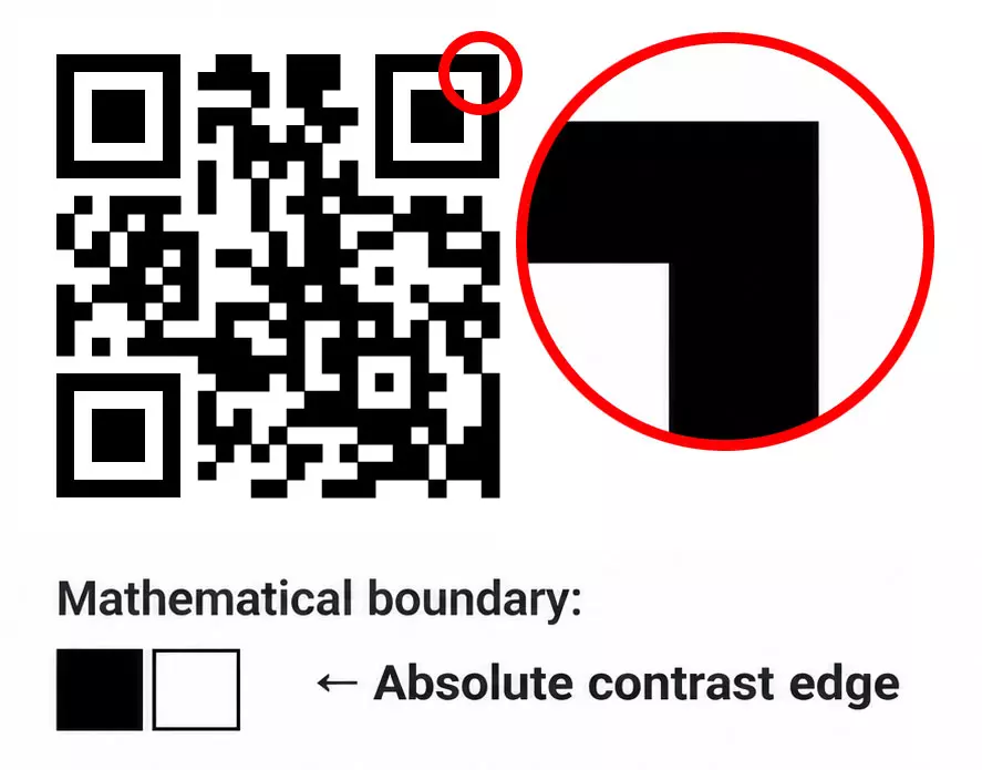
When a raster file is processed by a RIP (Raster Image Processor), the edges of every tiny square (module) are rendered with intermediate gray or colored pixels to smooth the line. When combined with mechanical dot gain (the physical spreading of wet ink as it absorbs into paper fibers), those soft borders bleed into each other.
To an optical camera sensor, blurred borders degrade the contrast threshold between light and dark modules, causing read errors.
The Rule:
Never send raster assets to print. A production-ready workflow requires mathematical vector files—specifically SVG, EPS, or vector PDF:
- Every module renders as a mathematically defined polygon.
- Line screens and plate exposures remain razor-sharp down to microscopic tolerances.
- The asset can be enlarged to a highway billboard or shrunk to a cosmetic box flap without losing a fraction of a millimeter in edge definition.
2. The Quiet Zone: Respect the 4X Rule
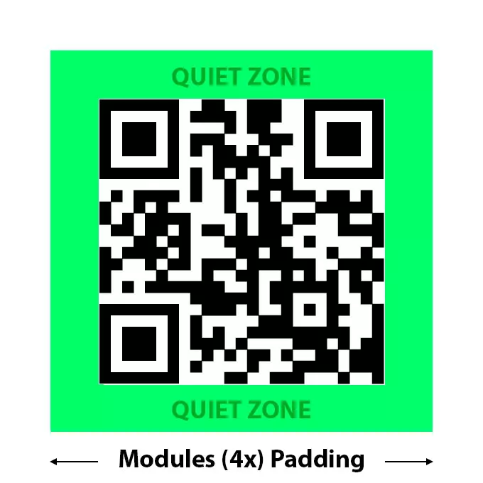
A QR code does not start where the black pattern begins; it starts at the outer edge of its Quiet Zone (the blank margin surrounding the code).
Under the international standard ISO/IEC 18004, a QR code requires a mandatory quiet zone of at least 4 modules (4X)on all four sides. If each tiny data square in your code is 1mm wide, you must leave at least 4mm of clean, uninterrupted background around the entire perimeter.
Why Quiet Zones Fail in Production:
- Clipping Masks: Designers place the code into an InDesign frame and accidentally crop the white border to align the visual bounding box with an adjacent text column.
- Background Bleed: Textured backgrounds, brand patterns, photography, or packaging fold lines run directly up to the finder patterns (the three large corner squares).
- Die-Cut Tolerances: When a code is placed too close to a trim or fold line, natural mechanical shifting during die-cutting can slice into the quiet zone, confusing the camera’s spatial normalization algorithm.
If the scanner cannot detect where the surrounding design ends and the barcode begins, it will fail to lock onto the finder patterns.
3. Contrast, Color Physics, and the “Inversion” Trap
Modern smartphone cameras are remarkable, but they still rely on binary thresholding: converting an image into a monochrome map of dark and light values to read data bits.
The Problem with Inverted Codes (White on Dark)
Designers often prefer white QR codes on dark backgrounds for aesthetic reasons. While the official QR standard supports inverted codes, and the latest flagship phones can usually read them, real-world performance drops drastically:
- Mid-range and budget smartphones frequently fail or take seconds longer to calculate inverted luminance.
- Dedicated handheld laser or CCD warehouse scanners (used in logistics and retail checkouts) are hardcoded to search exclusively for dark marks on light backgrounds.
Best Practice: Always design with dark foreground modules on a light background.
Optical Contrast vs. Visual Contrast
Just because two colors look distinct to the human eye does not mean they have sufficient optical contrast for a sensor:
- The Yellow/Orange Failure: A bright yellow code on a white background looks punchy on an RGB monitor. To an optical sensor measuring reflectance, both yellow and white reflect near-identical wavelengths of light. The result is unreadable.
- The Metallic Foil Trap: Hot-stamping a QR code in gold or silver foil creates specular reflection. Under direct store lighting, the foil bounces light straight into the lens, blinding the sensor with pure glare.
- Rich Black vs. Single-Plate Black: For small-scale offset printing, never color a QR code with 4-color Rich Black (C:60 M:40 Y:40 K:100). Slight registration misalignment between the four printing plates will create color fringing along module edges. Keep your codes to 100% K (single-plate black).
4. Error Correction Levels vs. Data Density
QR codes contain built-in Reed-Solomon Error Correction, allowing them to remain readable even if part of the code is torn, scratched, or obscured by a logo. There are four standardized levels:
| Level | Error Correction Capacity | Best Used For |
| L | ~7% of data restored | Ultra-clean, high-density industrial codes |
| M | ~15% of data restored | Standard default for clean print graphics |
| Q | ~25% of data restored | Outdoor posters, industrial shop floors |
| H | ~30% of data restored | Codes with centered brand logos or artwork |
A common mistake is automatically setting error correction to Level H “just to be safe.”
The trade-off is physical: higher error correction requires more data modules. A higher module count forces the code to subdivide into a denser grid. If you are printing on a small physical surface (e.g., a 20mm wine label badge), Level H will turn the modules into microscopic dots that may fill in due to ink dot gain.
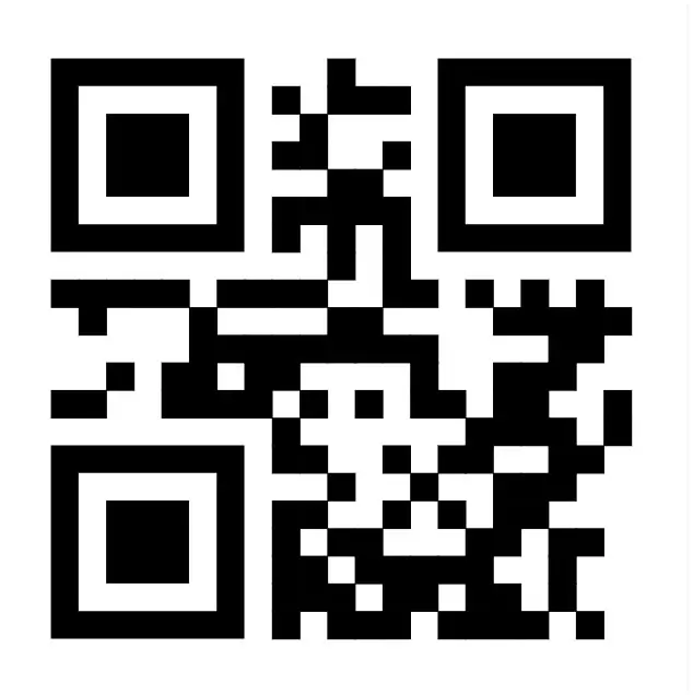
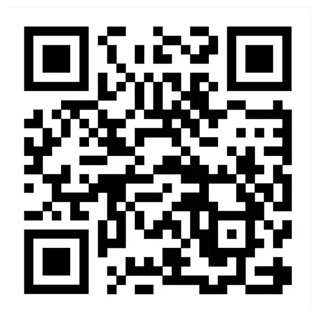
The Pro Formula: Keep your URLs as short as possible (using dynamic redirection on your server) and pair them with Level M. If you must embed a brand icon in the center, switch to Level Q or H, but enlarge the physical footprint of the code on your layout to compensate for the higher grid density.
5. Substrates, Coatings, and Curvature
The surface you print on dictates how a code behaves in the physical world:
- Uncoated Kraft Paper: High porosity means severe dot gain. Increase your module size by at least 20% compared to coated stock and widen the quiet zone.
- High-Gloss Lamination & Shrink Wrap: Surface reflections can blind phone cameras. Place codes on flat surfaces rather than across creases, or specify a matte varnish window over the code area.
- Cylinders (Bottles, Cans, Tubes): If a wide QR code curves around a 30mm cosmetic vial, the camera sensor cannot view both outer finder patterns simultaneously due to perspective distortion. Orient the code vertically where possible, or reduce its size so the entire matrix sits within a flat focal plane.
6. The Prepress Pre-Flight Checklist
Before exporting your print-ready PDF/X-1a or PDF/X-4 files, run through this five-point audit:
- ☑️ Format Check: Is the asset placed as an SVG, EPS, or vector PDF? (Zero placed PNG/JPG files).
- ☑️ Quiet Zone Verified: Is there a clean, unprinted border at least 4 modules wide surrounding the grid?
- ☑️ Color Separation: Is the code set to 100% K (or a single dark spot ink) with zero registration fringing?
- ☑️ Contrast Direction: Is the foreground significantly darker than the background? (Avoid inverted white-on-dark on high-risk packaging).
- ☑️ Real-Scale Test: Did you print a 100% scale proof on an office laser printer and test it with both an iOS and an entry-level Android device in modest lighting?
Clean Vector Assets Without Cloud Headaches
A reliable print design workflow depends on the quality of your source files. Relying on generic, ad-supported web generators often means dealing with raster exports disguised as vectors, forced tracking redirects from questionable third-party domains, or unexpected licensing restrictions.
For agencies and design studios that handle print packaging regularly, having a dedicated in-house generator makes all the difference. Tools like QRcdr operate directly on your own local environment or server:
- Pure, standards-compliant SVG and PDF vector exports with customizable module styling.
- Native control over error correction levels, quiet zone margins, and precise hex/CMYK color values.
- Zero external database requirements, zero recurring subscriptions, and complete ownership of your asset pipeline.
When you treat QR codes with the same typographic and prepress rigor you apply to corporate identity and layout grids, the technology becomes invisible. Your printed collateral looks polished, scans effortlessly, and bridges the tactile world to digital experiences without a single lost impression.
