
Magicards Documentation
Magicards is a professional WordPress plugin designed to create interactive card decks, memory games, and content grids. It is optimized for the Gutenberg block editor but remains fully compatible with all major page builders.
1. Installation
- Download the magicards.zip file.
- Go to your WordPress Dashboard: Plugins > Add New > Upload Plugin.
- Select the file, click Install Now, and then Activate.
2. Global Settings
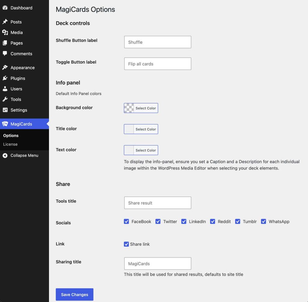
Once activated, a new Magicards menu will appear in your WordPress admin sidebar. Here you can configure the global defaults for your decks:
- Card Size: Define the default width and height (in pixels) for your card thumbnails.
- Deck Controls: Customize the position and alignment of the interface buttons, and set custom text for the “Shuffle” and “Toggle” buttons.
- Info Panel: Set the default global colors for the card back (Background, Title, and Text colors).
- Share: Configure social sharing options, including the tools title, specific socials to display, and default sharing links/titles.
3. Using the Gutenberg Block (Recommended)
The most intuitive way to build your card decks is through the native WordPress Block Editor:
- Open a Page or Post.
- Click the (+) button and search for the Magicards block.
- Configure your deck (images, columns, behavior) using the inspector sidebar on the right.
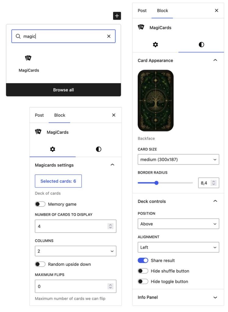
💡 Pro Tip: Magicards works perfectly in other page builders like Elementor, WPBakery, or Beaver Builder. To generate a custom shortcode easily: insert the Gutenberg block into a draft page, configure it exactly how you want, click the three dots in the block toolbar, and select “Edit as HTML”. Copy the resulting shortcode and its attributes, then paste it into your favorite builder as a standard shortcode.
4. Shortcode Attributes Reference
When using the [magicards] shortcode manually or via the “Edit as HTML” method, use the following parameters:
| Attribute | Description | Default |
| ids | Comma-separated list of attachment IDs for the cards | “” |
| backface | Attachment ID for the image used as the card back | 0 |
| col | Number of columns in the grid | 4 |
| num | Total number of cards to display | 1 |
| thumbsize | The WordPress image size used for the cards | magicard-thumb |
| updown | Allow cards to appear upside down (0 or 1) | 0 |
| description | Enable/Disable the info panel description (0 or 1) | 0 |
| share | Enable social sharing buttons (0 or 1) | 0 |
| memory | Enable Memory Game mode (0 or 1) | 0 |
| onecard | Enable Single Card draw mode (0 or 1) | 0 |
| noshuffle | Disable the random shuffle (0 or 1) | 0 |
| notoggle | Disable the manual flip toggle (0 or 1) | 0 |
| radius | Border radius of the cards (in pixels) | 0 |
| panel_bg | Hex code for the info panel background | #333333 |
| panel_title | Hex code for the panel title text | #ffffff |
| panel_text | Hex code for the panel description text | #ffffff |
Example:[magicards ids="10,11,12" backface="5" col="3" memory="1" radius="10" panel_bg="#000000"]
5. Content Customization
Magicards pulls data directly from your WordPress Media Library items to populate the cards and the info panel:
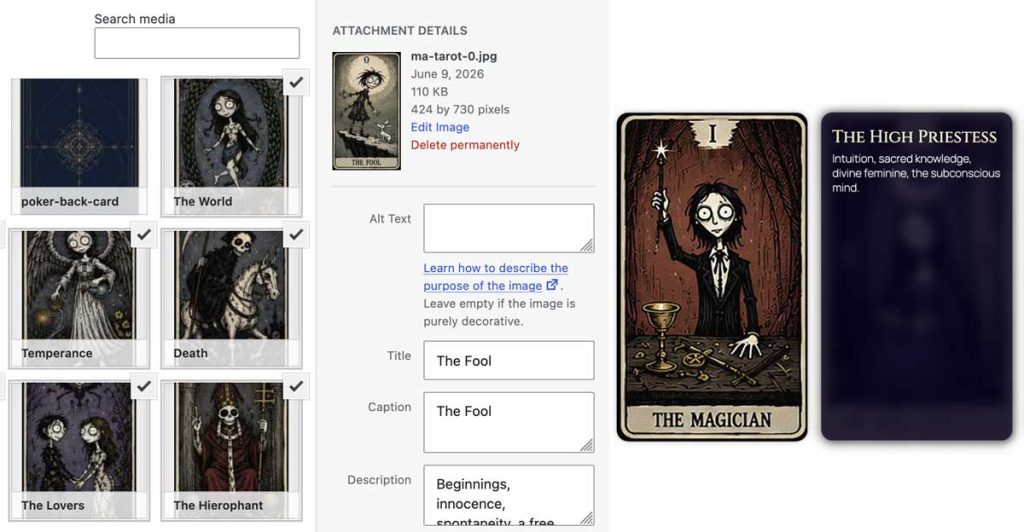
- Caption: Displays as the main heading in the info panel.
- Description: Displays as the body text in the info panel.
- Upside down: A specialized field that replaces the default Description if the card appears reversed (only when updown is enabled).
- Title and Alt Text: Used for accessibility and SEO.
6. Advanced Layouts
You can apply specialized layouts by adding these classes to the “Additional CSS classes” field in the block settings:
- cross-layout (9 cards, 3 columns)
- h-layout (9 cards, 3 columns)
- star-layout (6 cards, 3 columns)
- plus-layout (9 cards, 3 columns)
- x-layout (9 cards, 3 columns)
7. Custom CSS
Each Magicards block supports custom CSS. Use the .magicard-item selector to target specific card styles. Styles added via the Gutenberg block are scoped to that specific page for optimal performance.